
Empowering hosts to self-improve using reviews
A quick visual refresh based on data we already had
The problem
Hosts couldn’t find information to help them improve the quality of their rental experience. In addition, we would soon be evaluating them based on a new metric - percent of 5-star reviews - but visibility into this metric was limited in the current design.
The ask
Quickly redesign the page to emphasize a 5 star review paradigm for all categories while giving more transparency into reviews. We only had a few weeks - so this was a QUICK redesign.
Hypothesis
By arming hosts with this information (which we could make available), we could see a bump in vehicle quality. We also knew that without this information, Hosts would be frustrated if we would be evaluating them based on it.
To give hosts more specific things to improve, we wanted to add:
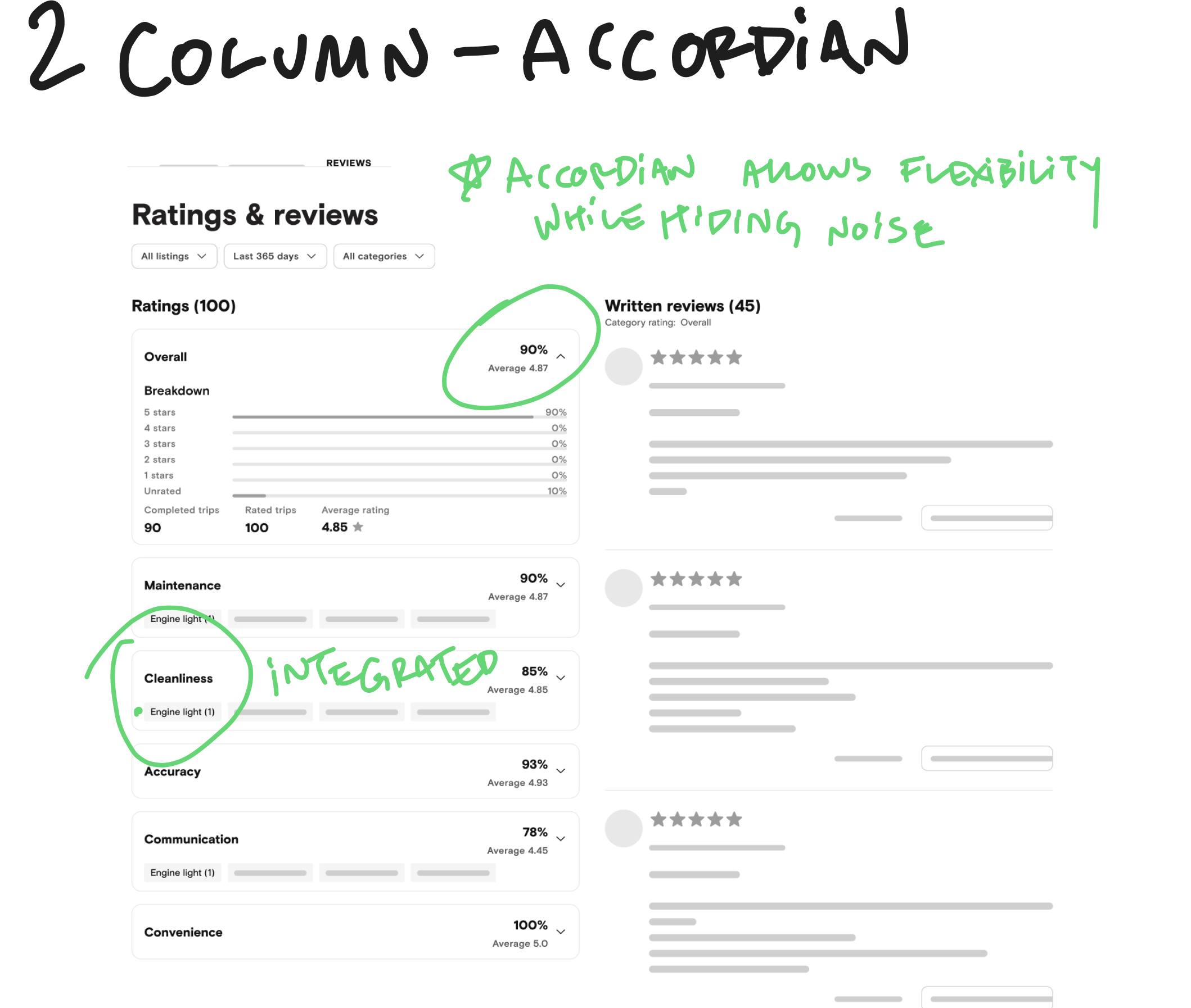
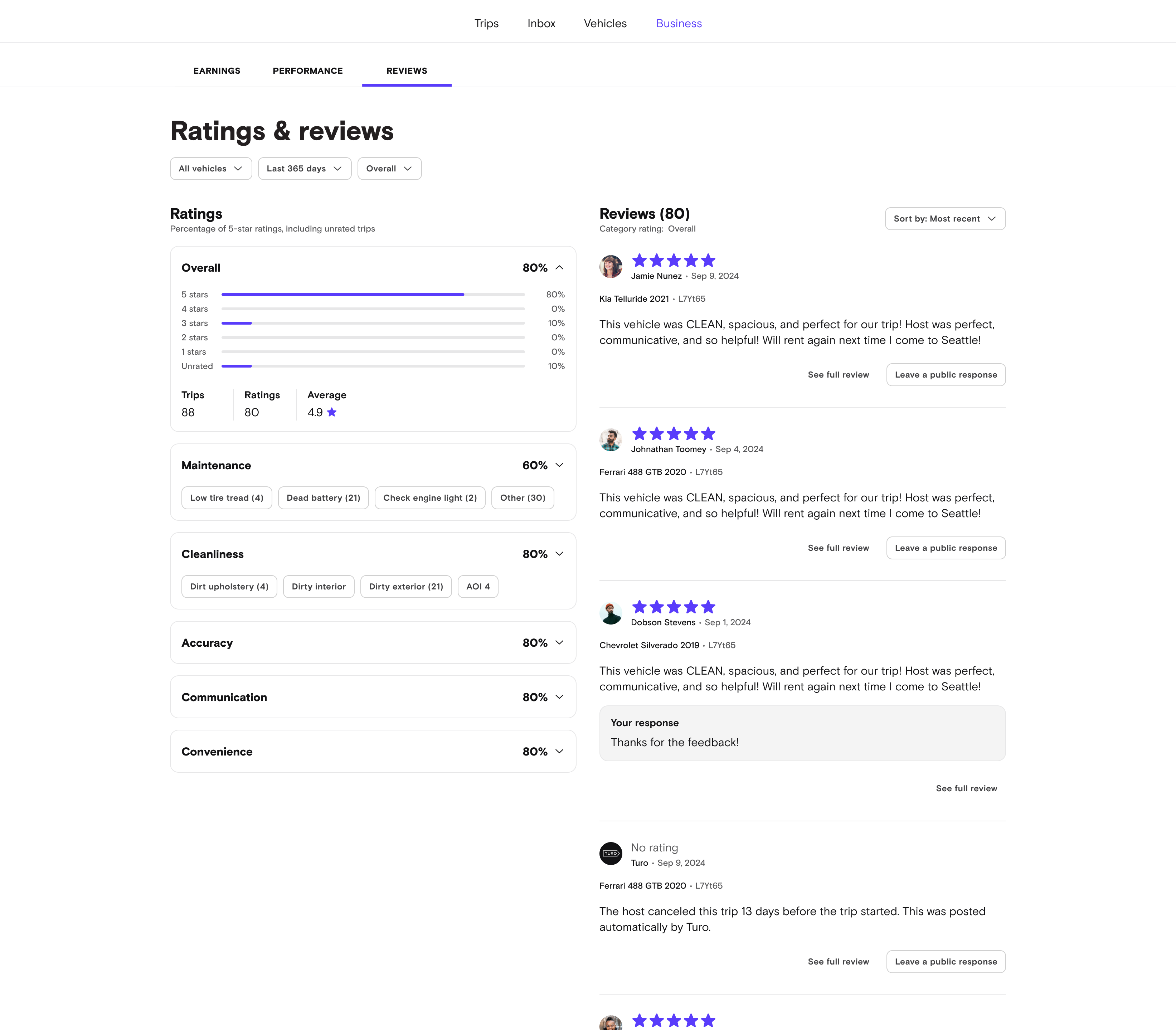
- 5 star percentage for all categories
- Ability to filter ratings by category
- Ability to filter ratings by star number
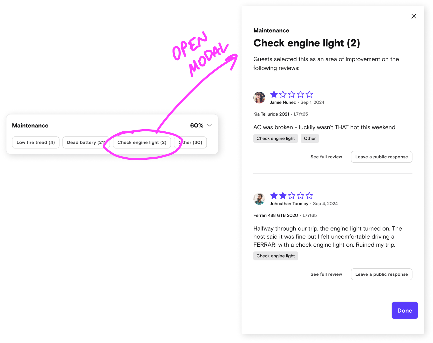
- Which review/trip an area of improvement was tied to
The original design
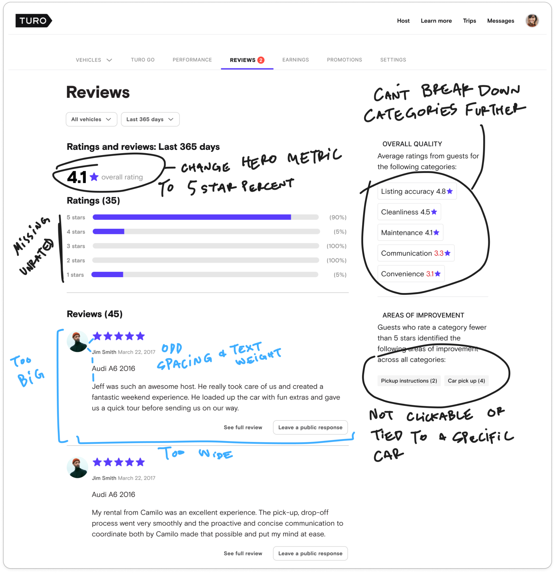
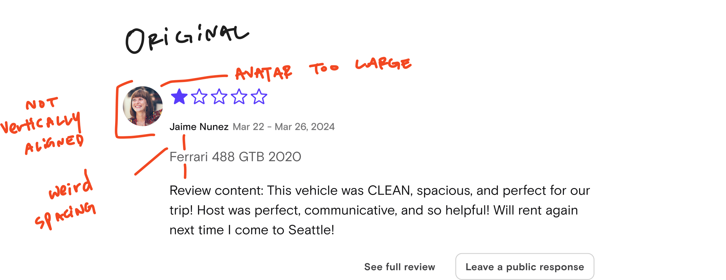
The previous design was a reused version of the guest reviews page, so the host perspective had been less considered/tailored. Hosts had been expressing the page made it hard to find specific things they could improve on, and was too high-level at times.
Competitive audit
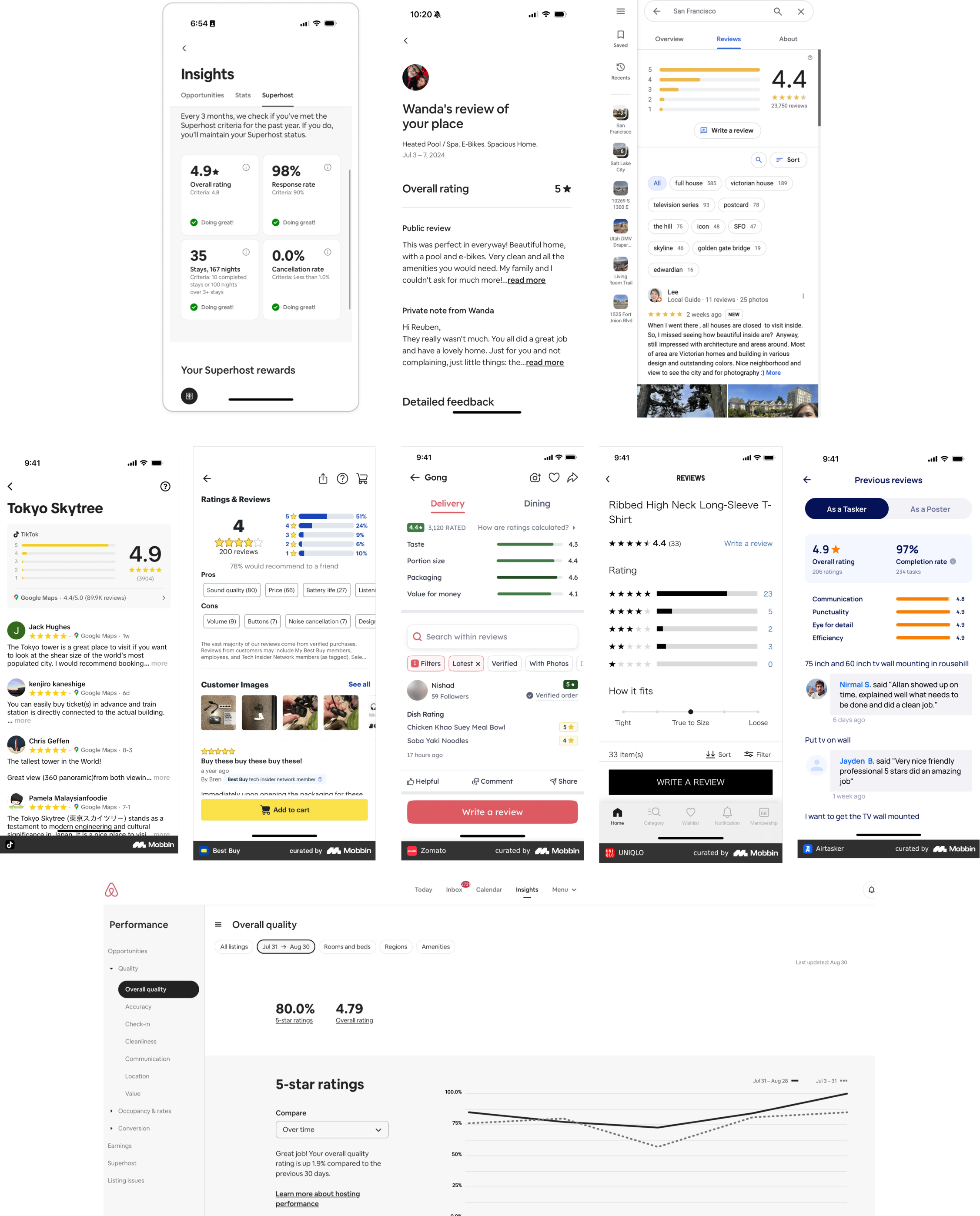
We wanted to quickly see how other companies structured their reviews data to see if any trends might be useful to follow. It was easy to find guest/customer-centric reviews, but much more difficult to find host-centric (or internal) reviews. We discovered that people appreciate more access to information. The more they can slice/dice/discover/drill down, the better. We could provide some additional functionality than what we had, but would be limited by time in building out exactly what hosts might want.
Initial concepts & explorations
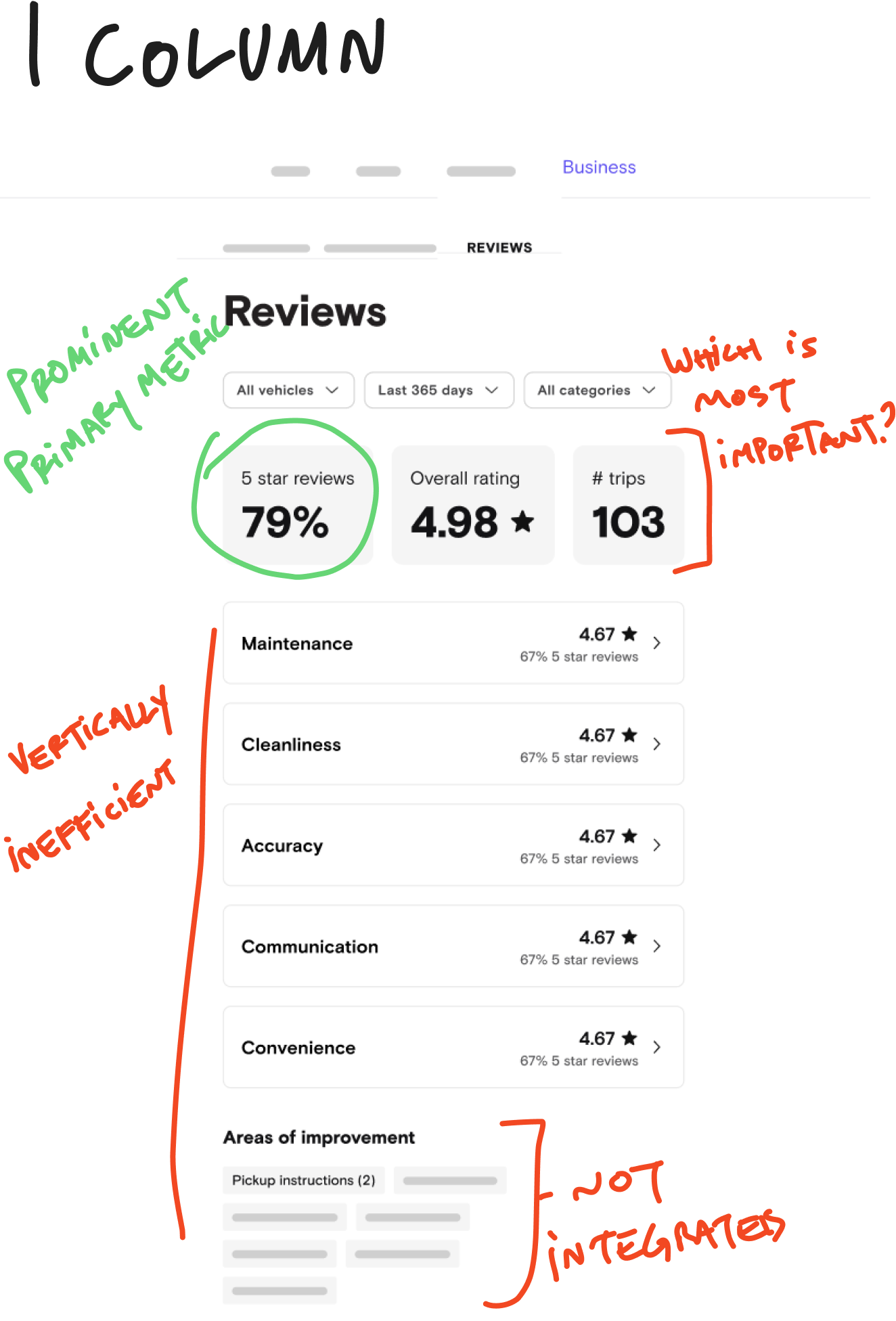
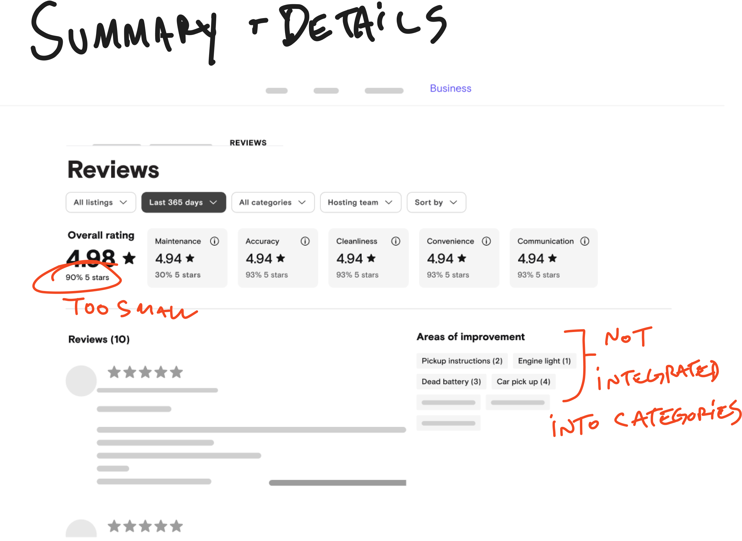
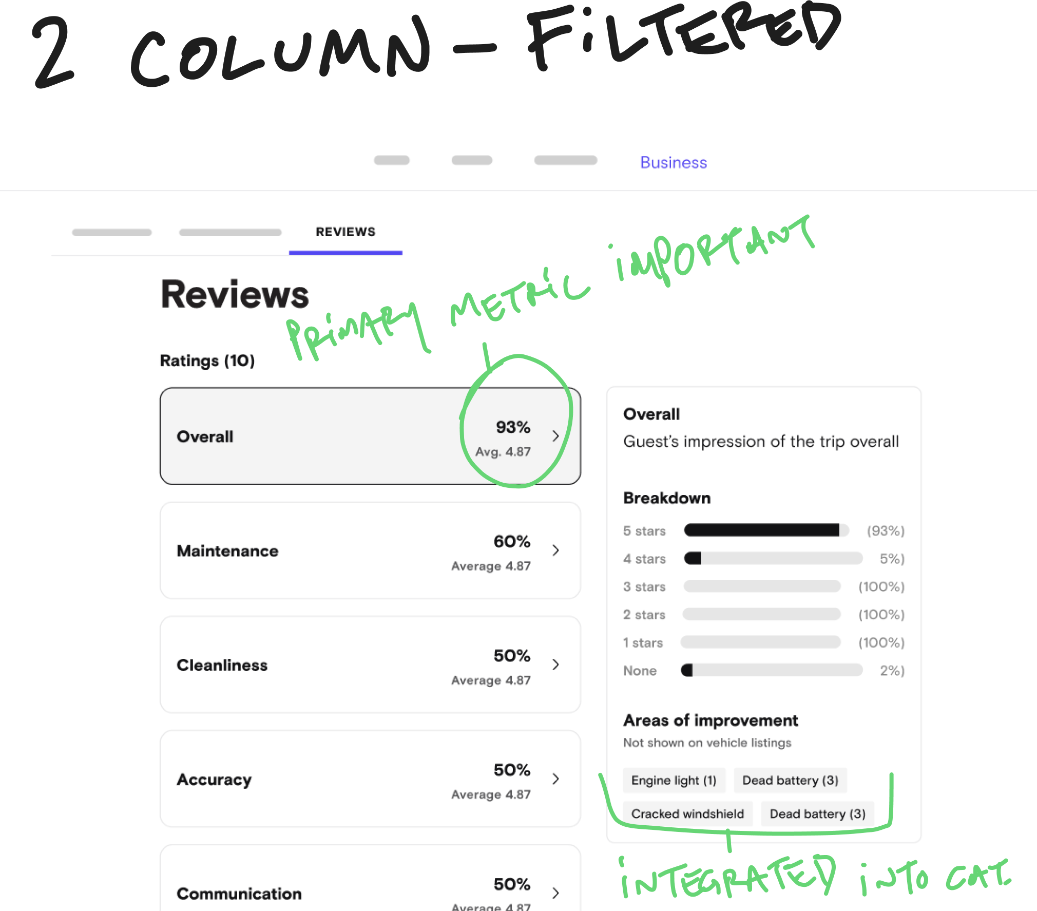
First, we needed to nail the layout of the page. Here are some explorations of that. We wanted to make sure the primary metric was front and center, while balancing the other information visually and hierarchically.
Deciding on a layout
Because it provided the most information, while prioritizing the primary 5-star metric, we decided on the layout below labeled “2 column - accordion.” Usability tests would confirm that this was the right move.
Design review
Visual feedback on individual reviews
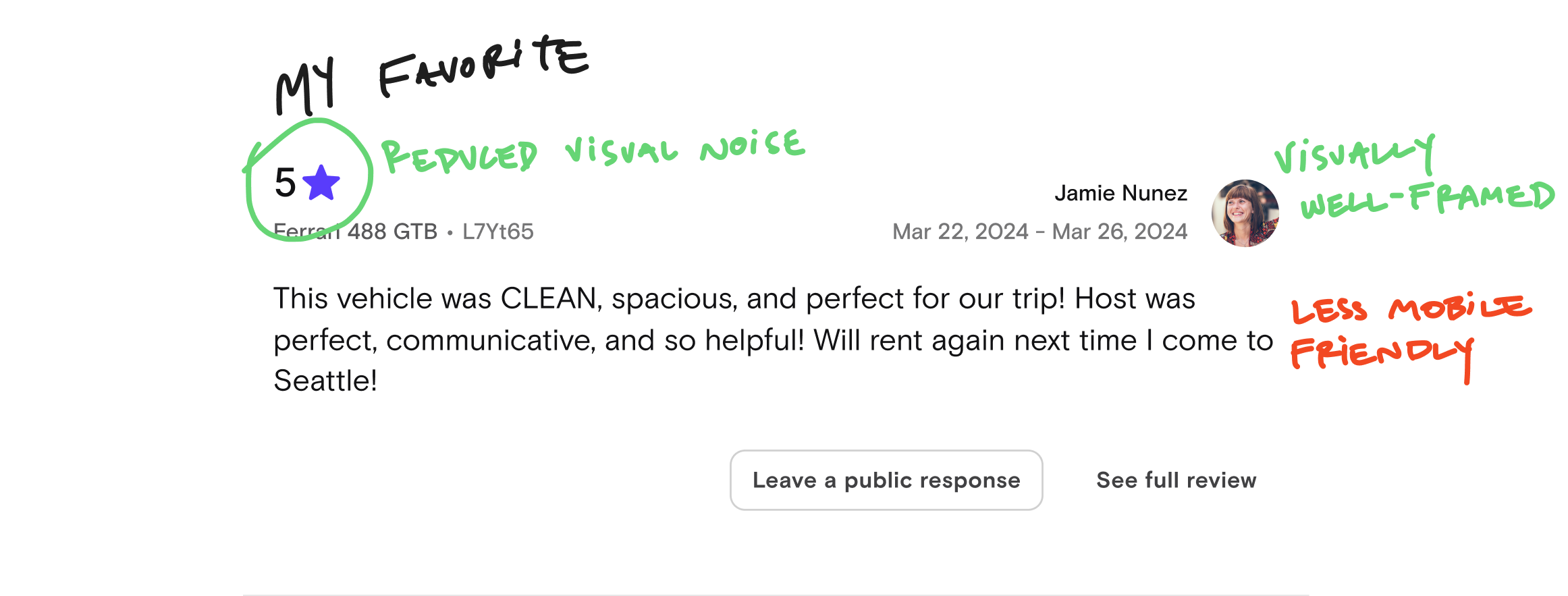
Our design director determined we could be more efficient with space on the reviews. We did some visual iteration on the individual reviews.
Compromising with other teams
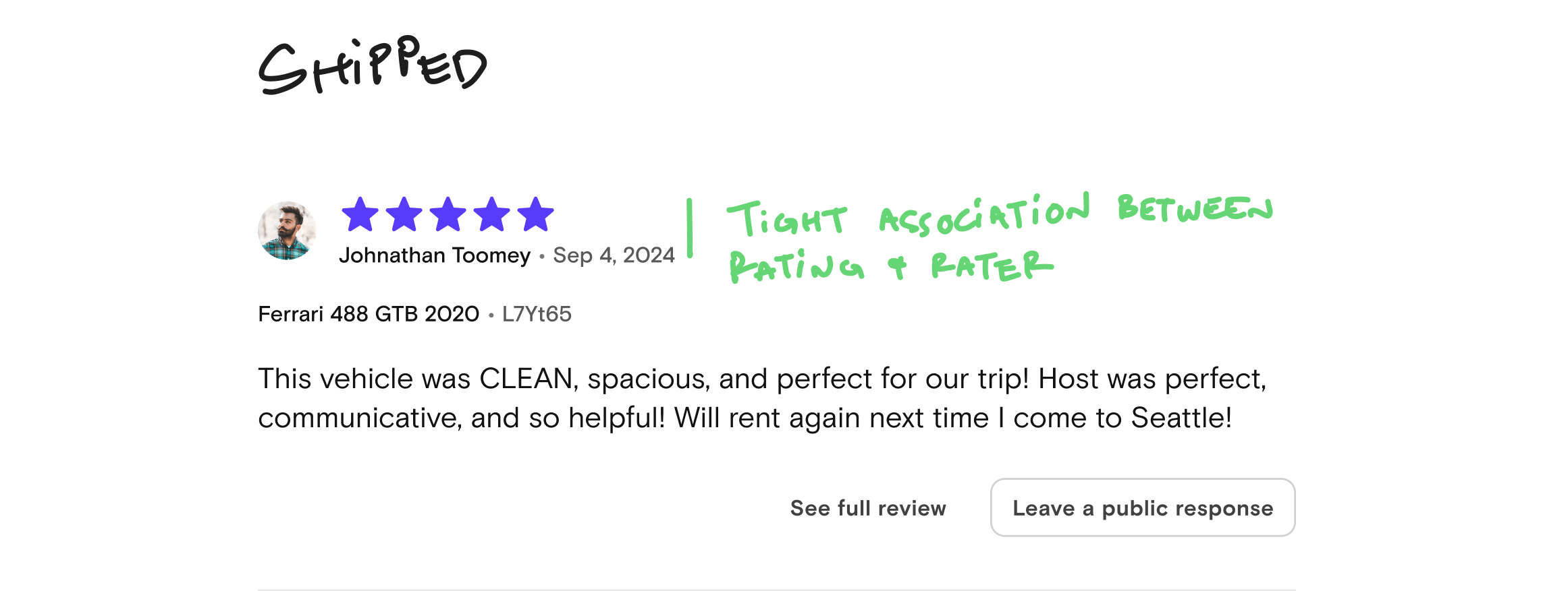
When we got down to specifics, my preferred visual design was not the one shipped. Our host team wanted the visual design of the rating to have tighter association with the person giving the rating. Our design systems team wanted all stars to be displayed visually (rather than numerically) to be consistent with our design language.
I disagreed with both of these pieces of feedback (5/10 disagree), but I knew these were small compromises we could make in building trust with both teams. We shipped the design they preferred.

Final design
We got great feedback from hosts that they could more easily see ways they could improve their cars, and that they appreciated the details.
Clickable prototype
Interactive areas of improvement
Hosts wanted to know which car guests identified for improvement - we made these clickable.
Outcome
Easier to use
This wasn’t a perfect and total redesign, but hosts mentioned that it helped them get the information they needed to improve faster and more easily.
5 star percentage
Now this would be the primary metric used on this page - this would be important for Turo’s next phase of vehicle quality monitoring.
What I’d do next
Areas of improvement are arguably not useful in the long-term. For example, if a host’s car had an issue with balding tires - that would only be useful only until the tires were replaced. So I’d focus on helping hosts anticipate, track, and resolve these issues.
